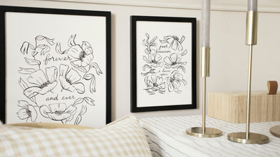
New: Floral Line Art Wall Prints
It feels as if I've been sketching, painting, editing, tweaking, and sneak-peeking forever, but it's finally time! The new Linework Love collection is LIVE and I'm so excited to share it with you.

Floral Prints in a Line Art Style...
I started work on this collection all the way back in January. I had just launched my Spring Florals after so many of you asked me to make print versions of the pages of my Floral Wall Calendar, and I was just starting to play around with ideas for my next collection.
I never actually intended my next project to be a linework style collection (though the idea had been floating at the back of my mind for some time) and infact, the design that prompted it all was just a little practice piece - a doodle almost - that I made in my sketchbook between waiting for other, more paint-heavy pieces to dry.
I loved how it looked though, and when I shared it on Instagram, it got such an excited response from so many of you that I decided to seize your excitement and my enthusiasm and pull this idea the the forefront. (Don't worry - those other things I was working on? Still on the back burner!)
Usually when working on a collection, I'll have already created a big moodboard to inspire the feel and the vibe of a collection before I've even started painting, but because the first piece was almost inspired by other pieces of my own work the design process was a little different to usual. Before I drew the piece that started it all, I'd been looking at victorian greetings cards - with fancy calligraphy framed by elegant still life floral scenes - so I started from there, but once I got a feel for how I wanted the florals and lettering to sit, I mostly went from there and didn't refer back to any "reference material" much.
Love and Self Care Quotes
Working on this after a year of lockdowns definitely had it's impact on the collection - I was very focused on creating pieces that were full of loving sentiment, something that would make you smile every time you walked past it in your hallway, or to send to a friend you couldn't see in person, and as always, I wanted to inject a bit of appreciation for nature and growth into the words as well as the illustrations - I can never resist a subtle pun.
That's how the Home is Paradise print came to be - a sort of "less cheesy" take on "home is where the heart is" - perfect for homebodies like me, as well as the Brighter You Bloom print, a reminder that like many things in nature, we often come back better and brighter when we allow ourselves to rest - something that's been a big struggle for me over the past year or so.
There were some pieces that just flowed naturally from my pencil as I sketched them out - words that were bouncing about in my mind that just felt right to put onto paper - but others I chose with a bit more purpose, with gifting and occasions in mind. I find this approach often helps me strike some kind of balance - of creating what feels natural, and then "fill in the gaps" with words that suit the occasions that I know lots of you are often looking for.

Floral Linework Birthday Card
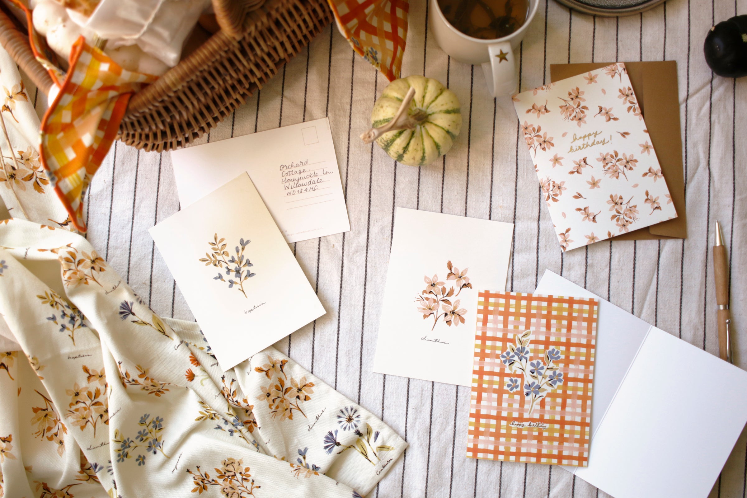
Floral Greetings Cards
Taking a more pared-back approach on the design for this collection gave me an opportunity to search for something a bit extra when it came to the cards in the collection. I coudn't get the idea of an elegant, die-cut shape to frame the simpler floral design out of my head, and so I decided that this was the perfect opportinuty to add a little extra luxe to the collection. I was inspired by the nostalgic feel of old postcards, cut in shapes other than a standard rectangle, to lend my own designs a bit of that classic, elegant feeling. I designed a custom shape that had echoes of Nouveau/Art Deco shapes, without trying to hard to be "vintage", and I am so pleased with how they turned out. Each design was printed on these cards in a glossy black foil too, for an extra old-school, "letterpress" feel.

Investing in this new technique turned out to be a scarier process than usual - the foil application requires metal foiling blocks to be custom made, as does the die-cutting shape, which was a super nerve-wracking process. So much of the finishing touches to the cards relied on design files being perfect, and the prospect of having to have these dies re-made if they were perfect. The cost investment on these dies was much bigger than my usual investment in a collection, so I was super nervous that I'd make a mistake, but in the end they turned out perfect, and the extra time, money and stress was worth it, as it creates a really striking look, particularly paired with the black envelopes.

Floral Line Art Wrapping Paper
Floral Patterned Wrap
Last year I started adding wrapping paper to my site to match many of my existing collections, so it only made sense to continue the habit as I went on with new collections, and I was so excited to put this one together. As so many of my designs are very rich in colour and detail, the resulting patterned papers tend to be quite loud, but I was excited to create something a little more pared-back with the linework wrapping paper . I transferred some of the florals into my own pattern to create a monochromatic but still detailed and delicate design that pairs wonderfully with the collection, which I think rounds off the collection nicely.

The Shoot
I won't go into too much detail here because I documented the behind the scenes over on Instagram, but it's safe to say that I felt like doing something different for this collection, and so I set up and styled a shoot for it that I hoped would do the collection justice. If you didn't know, I shoot pretty much all of my own photos (unless I'm sharing customer snaps) and I am often limited by the constraints of living in a rental home, without the glamorous original features or paint hues I'd truly love to style this collection with. So, I decided to set up my own "wall" to shoot this collection with to help create the image I had in my head. Check out my Instagram reel if you want to check out the behind the scenes!
Shop The Collection
After months of designing and weeks of preparation, the collection is now finally live! I hope you love it as much as I do. It was so exciting to play with a slightly different style, and to create something a little more pared-back than usual. Check out the entire Linework Love collection now, and choose from 6 delicious prints in a choice of two sizes, 12 beautifully die cut and foil-finished greetings in an array of warm and loving messages, and top it off with a delicate patterend gift wrap! Discover the Linework Love Collection here.